As eCommerce developers, we’ve build hundreds of online stores and we’ve seen and analyzed thousands. And we noticed that the most important thing that distinguishes good, well performing websites from the losers is the way they design product pages. Of course product matters, but customers care about experience around the product even more. That’s why Apple spent billions of dollars developing their retail stores.
While developing new online store, owners invest lots of time and efforts into Homepage, website structure, checkout process, etc., instead of focusing on designing a perfect product page. Visitors that made it to product page are just few clicks away from buying (and it costs you money to get them there), but if they don’t get great experience – these few clicks are never going to happen.
As mentioned in Kissmetrics’ article, good product page is the one that provides the information, assurances and motivation the visitor needs to become your customer. But what turns ordinary product page into a good one?
SEO aspects
Usually developers focus on layout, design and content forgetting about SEO. SEO is focused on users rather than search engines nowadays, so it’s important to do it right.
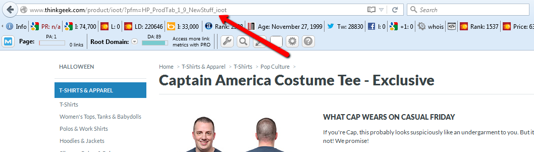
Product URLs should be clear and meaningful. Use www.example.com/category/product-name or www.example.com/product-name instead of www.example.com/p/?=FosrFIDk492D. Aside improving websites’ SEO, it also helps users to navigate the website and understand what the product is about.
Make sure product title and description are unique and descriptive because a) It affects website rankings. b) Users may get confused while searching for your product in search engines.
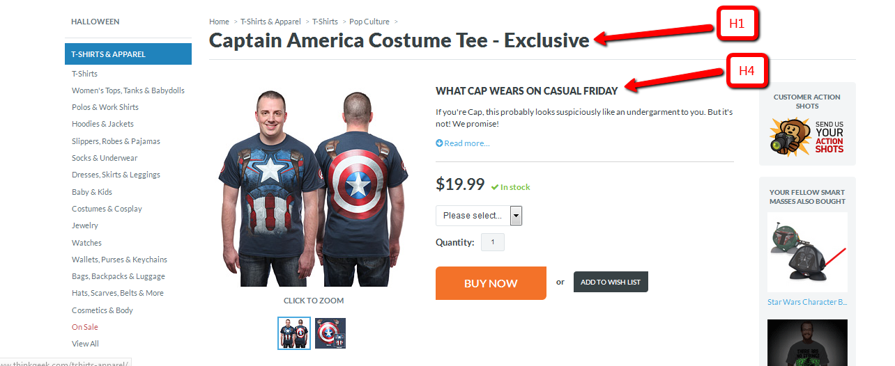
Pay attention to Headers (H1, H2, H3, H4, H5 and H6). a) As well as titles, Headers help to understand page content b) Make them eye catching and interesting.
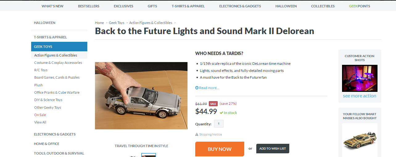
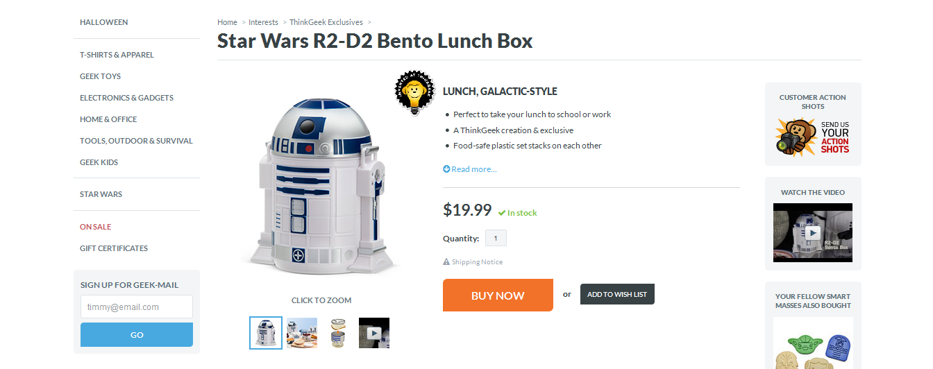
I’m going to use lots of examples from thinkgeek.com as their website is perfect. Well, almost perfect.
Multimedia
Selling physical goods? Use images! Selling digital goods? Use even more images!
More than 50% of users think a high-quality photo of a product is more important than product information, description, or rating and reviews. While images are important, ignoring few basic rules will harm a website rather than improve.
Use as many high quality images as possible. It doesn’t mean uploading 70 images is a great decision, but 5-7 images are way better than two.
Quality matters. Image quantity doesn’t matter if the quality is low. Make beautiful pictures and show the essence of your product. Don’t use manufacturer-supplied images. If hiring professional photographer is too expensive, cooperate with your team and devote some time and resources to generate professionally looking images.
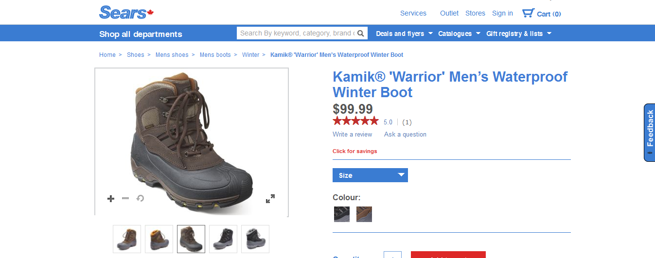
Show your product from different angles. Make sure customers can see how the product looks from the front, from behind, inside, etc. Here’s a great example from Sears.
Customers love large images because they look great. Conversion rate grew by 63% when Skinner Auctions increased the image size from 250px to 350px.
Show your products in action. Customers have harsh times imagining the actual size of a product or how it looks when being used.
People love videos. Provide useful video of your product features or usage process if possible and your customers will appreciate that.
Product description. Make it speak.
Make sure it’s unique. Even if there are different product pages for similar products. Seriously, it’s important to write unique description for each product. Not only it improves your websites’ SEO, but pleases your customers as well.
Write useful, informational and decent content. Two lines are not enough. We recommend writing not less than 100 words per page.
Focus on benefits, not features. No one cares how cool a product is if the benefits are unclear.
Include information that isn’t clear from the pictures. Is it heavy? Is it easy to clean? Is weight important? Try to answer all the questions that potential customers can have.
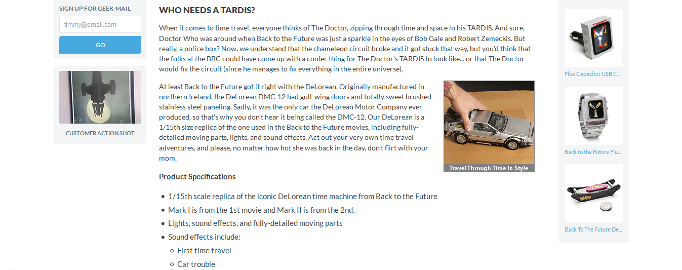
Don’t make it boring. Create a story around your product, make it emotional and fun. I always read product descriptions at thinkgeek.com because they are glorious!
Call to Action Optimization
As product pages have a lot of content, making Call to Action stand above the content is important. Some etailers try to experiment a lot with CTA buttons trying to make it unique from other stores. But the key point here is to keep CTA clear and easy to find.
Not need to name button “Add to a bag” or “Add to a basket”, as it may lead to confusion because people got used to “Add to a cart” variant.
Make it big and choose contrasting color.
If a product page has few buttons (Add to wish list, Compare products, etc.), make sure that your primary Call to Action distinguishes form other buttons and looks more important (Bigger, different color)
Make sure they it does what it says. Make sure “Add to cart” doesn’t lead to checkout.
Here is example from thinkgeek.com (again):
Eliminate customers’ fears
Customers always have doubts, uncertainties, and fears when spending money, especially if it’s their first order with your store. Customers may worry about quality, shipping time, security and tons of other things. In order to deal with customers’ fears, you need to eliminate all objections they face.
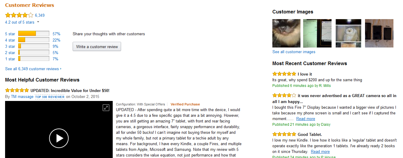
Use customer reviews and testimonials. According to the case study from Bazaarvoice, products with reviews show a 12.5% higher conversion rate than those without. Quantity matters as well; products with more than 20 reviews show a 83.85% higher conversion than those without reviews. There are few reasons why reviews increase conversion rate: a) Reading product specifications doesn’t help customers to understand if this product is actually good. b) Customers tend to trust more what others are saying about your product rather what you say about it.
Amazon does a great job it providing user generated reviews. You can rate a product, attach video to your review, vote for reviews left by others and much more.
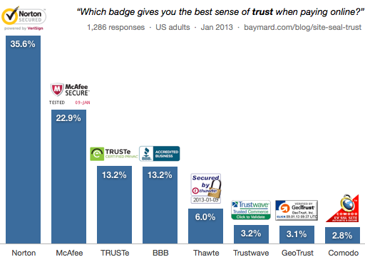
Add security badges. Some people fear that they’ll be scammed or robbed after providing personal and credit card information (especially older ones). To prove your store is secure, add security badges to most important pages (or even site wide). According to the study by Baymard Institute, people trust the most the following badges:
These badges differ in type. McAfee, BBB Accredited, TRUSTe are trust seals (store authenticity) while Norton, Thawte, Trustwave, Geotrust, Comodo are SSL seals (security encryption). Most customers don’t know what SSL is and the icon is everything that matter.
For example, toysrus.com provides Norton badge on shopping cart and checkout pages.
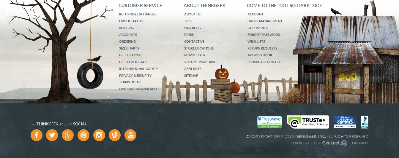
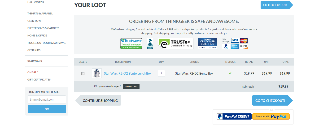
While thinkgeek.com placed badges in their footer site wide and also added seals to shopping cart.
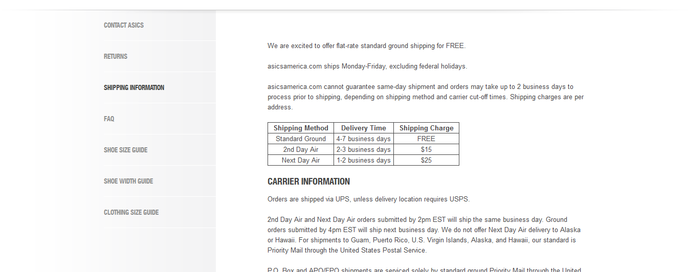
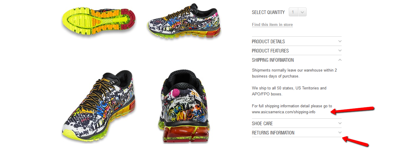
Try to add all possible information and guides customers may need (Shipping, Warranty, Returns Policies, Size Guide, etc.). Providing detailed information about shipping, return policy and warranty is especially important as usually these are the last concerns consumers have. So make sure this information is available and easy to find. Asicsamerica gathered all important information at one place.
But it can be easily reached from any product page.
Add live chat and make sure it can be easily reached from product page. Live chat button may be available site wide or added to every product page.
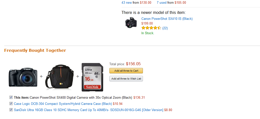
Up-selling, cross-selling and simply giving options
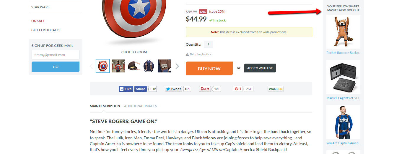
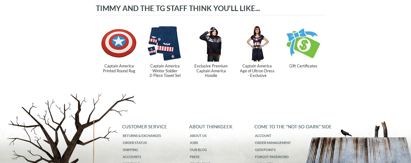
Not only you can increase revenue with up- and cross-sell, but help customers as well. What if a customer wants to buy a t-shirt with Cartman from SouthPark but is currently staring at t-shirt with Stan on it? Don’t make customer spend additional time searching – show recommended products. Here’s the way thinkgeek cross-sells (I wanted to buy Captain America Shield Backpack:
Amazon does a great job in terms of up-selling:
Additional tips
Page loading time should be under 3 seconds. Every additional second in page loading result in a 3.5% decrease in conversion rates. If you use Magento, check our article about speeding it up.
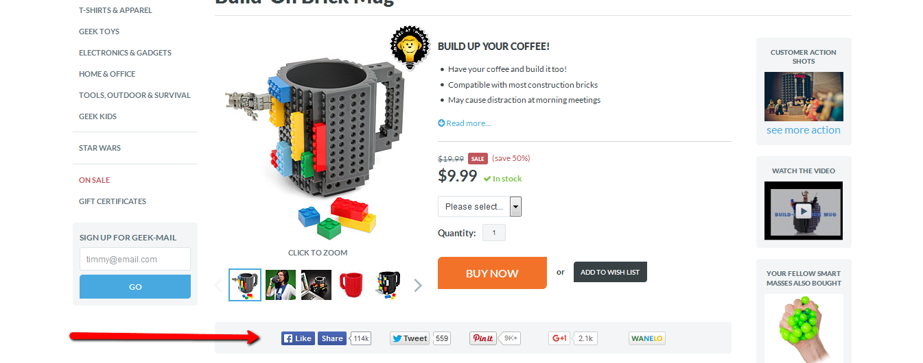
Add social share buttons. We are social beings and we love sharing things. Plus, let your customers promote your products!
Show product availability. It’s disappointing to find out that the product is no longer in stock after 15 minutes of reading and comparing.
Show payment methods. Thinkgeek shows payment methods on shopping cart page but it’s also a wide spread practice to add payment methods to product page or even site wide in footer section.
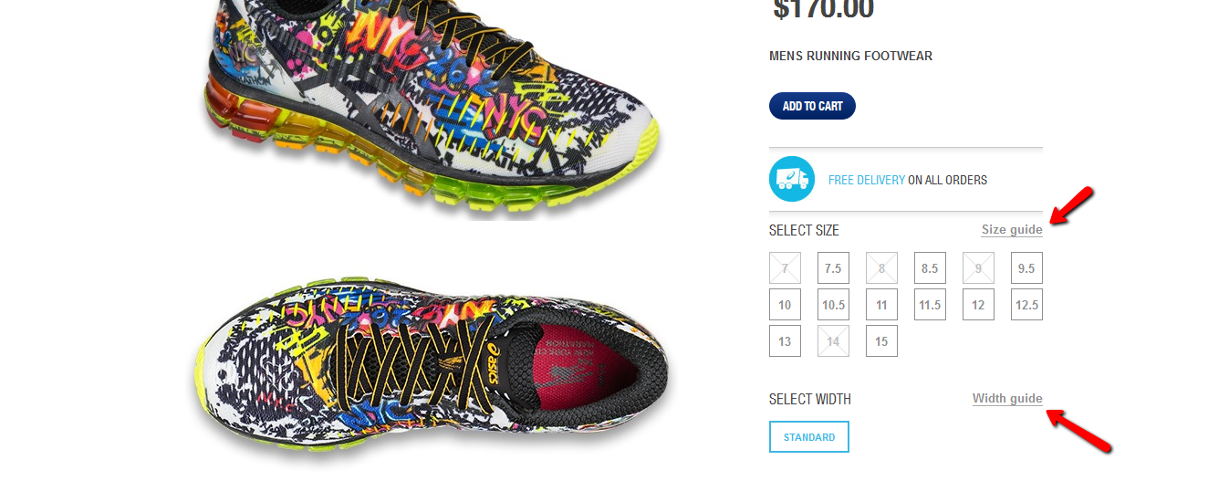
Add sizing guide (especially if you sell clothes or shoes). If you ordered clothes from Aliexpress, you know that sizes don’t actually match.
Add color options and make sure to provide images of all color combinations available.
Add international pricing if you ship overseas.
Highlight special offers (sale, buy one get one free, etc.)
 I’m going to use lots of examples from thinkgeek.com as their website is perfect. Well, almost perfect.
 Eliminate customers’ fears
Customers always have doubts, uncertainties, and fears when spending money, especially if it’s their first order with your store. Customers may worry about quality, shipping time, security and tons of other things. In order to deal with customers’ fears, you need to eliminate all objections they face.
Eliminate customers’ fears
Customers always have doubts, uncertainties, and fears when spending money, especially if it’s their first order with your store. Customers may worry about quality, shipping time, security and tons of other things. In order to deal with customers’ fears, you need to eliminate all objections they face.
 These badges differ in type. McAfee, BBB Accredited, TRUSTe are trust seals (store authenticity) while Norton, Thawte, Trustwave, Geotrust, Comodo are SSL seals (security encryption). Most customers don’t know what SSL is and the icon is everything that matter.
For example, toysrus.com provides Norton badge on shopping cart and checkout pages.
These badges differ in type. McAfee, BBB Accredited, TRUSTe are trust seals (store authenticity) while Norton, Thawte, Trustwave, Geotrust, Comodo are SSL seals (security encryption). Most customers don’t know what SSL is and the icon is everything that matter.
For example, toysrus.com provides Norton badge on shopping cart and checkout pages.
 But it can be easily reached from any product page.
 Amazon does a great job in terms of up-selling: